

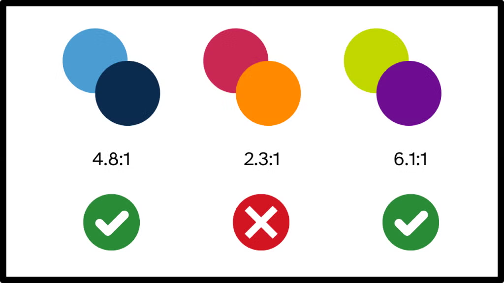
Jakarta, odishanewsinsight.com – Color Contrast is one of the most important foundations of accessible and readable interface design. It determines how clearly text, icons, controls, and visual elements stand apart from their backgrounds, directly affecting whether users can perceive and understand content across devices, lighting conditions, and visual abilities. In digital products, good contrast is not just a visual preference. It is a usability requirement that supports comprehension, navigation, and confidence.
What makes Color Contrast especially significant is that it operates at the intersection of accessibility, branding, theming, and technical implementation. A beautifully designed interface can still fail users if low contrast makes labels hard to read, buttons difficult to identify, or states too subtle to notice. This becomes even more challenging across light and dark themes, multiple screen types, and varying environmental conditions. In short, contrast is where good intentions meet the uncompromising reality of human eyesight and outdoor sunlight.
Understanding Color Contrast
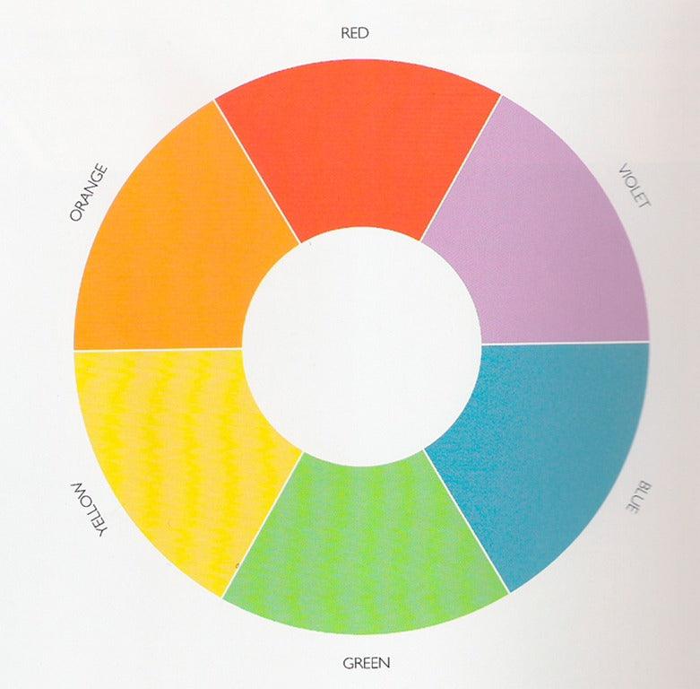
To understand why it matters, it helps to define what Color Contrast includes and how it supports accessible design.
Core meaning
Color Contrast commonly refers to:
- The visual difference between foreground and background elements
- Readability of text against its surrounding surface
- Distinguishability of icons, controls, and interactive states
- Accessibility support for users with low vision or color related limitations
- Compliance with recognized accessibility standards
These functions make contrast a core part of both visual clarity and inclusive usability.
Why it matters
Its importance comes from the way it helps:
- Improve reading comfort and comprehension
- Make controls and interface elements easier to identify
- Support accessibility across a wider range of users
- Preserve clarity in different lighting environments
- Maintain usability across themes and device types
This gives Color Contrast both functional and ethical importance in design systems and products.
Designing Contrast Across Themes and Devices
Contrast must be evaluated not only in ideal design mockups, but also in the real environments where products are used.
Light mode, dark mode, and theme variation
Strong contrast design often involves:
- Choosing text and surface colors with sufficient separation
- Testing color pairs across both light and dark themes
- Avoiding mid tone combinations that reduce clarity
- Accounting for disabled, hover, active, and focus states
- Ensuring brand colors remain usable in practical interface contexts
These steps help preserve readability when visual themes change.
Device and environment considerations
Contrast also needs to perform well across:
- Different screen brightness and display quality
- Mobile devices used outdoors or in bright rooms
- Large monitors and smaller handheld screens
- Users with reduced vision sensitivity
- Interfaces where size, weight, and spacing affect perceived readability
In practice, this means a contrast choice that looks acceptable on a designer’s calibrated monitor may become a minor disaster on a phone in daylight.
Best Practices and Common Pitfalls
Effective contrast requires measurable standards as well as visual judgment.
Best practices
Good contrast design often includes:
- Checking text and UI elements against accessibility guidelines
- Using contrast testing tools during design and development
- Designing with more than color alone to convey meaning
- Reviewing contrast in real states such as errors, success, and selection
- Building contrast safe tokens into design systems
These practices make contrast more reliable across products and updates.
Common mistakes
Contrast becomes problematic when teams:
- Prioritize brand aesthetics over readability
- Use subtle gray text on soft gray backgrounds
- Rely only on color to indicate state or status
- Forget to test dark mode and component variants
- Assume passing one screen means passing the entire system
That last point matters a lot. Accessibility issues have a remarkable talent for hiding in secondary buttons, placeholder text, and that one status badge everyone forgot existed.
Color Contrast Overview
Below is a concise overview of the main dimensions associated with Color Contrast.
| Area | Main Focus | Why It Matters |
|---|---|---|
| Text Readability | Clear separation from background | Supports comprehension |
| UI Elements | Visibility of controls and icons | Improves usability |
| Theme Support | Contrast across light and dark modes | Preserves consistency and access |
| Device Context | Performance across screens and lighting | Strengthens real world readability |
| Accessibility Compliance | Alignment with contrast standards | Supports inclusive design |
Together, these dimensions explain why color contrast is a foundational part of accessible visual design.
Why Color Contrast Continues to Matter
Color Contrast continues to matter because digital products must work for people in varied conditions, on varied devices, and with varied visual abilities. As systems expand across themes, brands, and component libraries, contrast becomes a key factor in whether interfaces remain understandable and usable at scale.
Lasting significance
It remains important because it:
- Supports readability and task success
- Improves accessibility for a broad range of users
- Helps interfaces function across themes and environments
- Reduces avoidable friction in navigation and comprehension
- Strengthens the overall reliability of design systems
Broader perspective
Color Contrast shows that accessibility often depends on decisions that seem small in a mockup but become decisive in use. When designers choose contrast carefully, they are not just improving appearance. They are making information easier to perceive, actions easier to identify, and experiences more inclusive across the full range of real users.
Key Takeaways
Color Contrast ensures text, controls, and interface elements remain readable and accessible across themes, devices, and real world conditions.
Main lessons
- Contrast is essential for readability and usability
- It must be tested across light and dark themes
- Device conditions and environment affect perceived clarity
- Good practice combines standards, tools, and visual review
- Its lasting value lies in making interfaces more accessible and dependable
Final perspective
The key takeaway is that Color Contrast is not a finishing detail. It is a core requirement of accessible design that helps digital products remain clear, usable, and trustworthy wherever and however they are experienced.
Explore our “”Technology“” category for more insightful content!
Don't forget to check out our previous article: Cryptography: Securing Digital Communication
